

You are using an out of date browser. It may not display this or other websites correctly.
You should upgrade or use an alternative browser.
You should upgrade or use an alternative browser.
Logo in development...
- Thread starter jw83876
- Start date


MapMaker53
Well-Known Member
- Joined
- Jan 7, 2018
- Messages
- 486
- Reaction score
- 539
- Age
- 71
- Location
- Long Island, NY
- Website
- www.zazzle.com
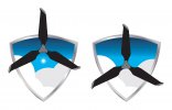
As a graphic artist, my number one rule when it comes to logos is keep it simple and ask yourself a few questions. Will it print as well on stationary as it will on the side of a van? Will fine details hold when reduced down to smallest use size, or will they disappear or - even worse - turn into a single blob? Will the use of color gradients and translucence make printing more expensive and complex? Will the logo design be able to be easily embroidered on caps and shirts? If you look around in the world, most well known and easily recognizable logos are not complex.
I think your logo, though very nice looking, will be very challenging for the various printing services due to your extensive use of color/tone gradients. My advice before you incur the cost of a trademark would be to speak to the various types of printing services you may wish to use in the future and get their opinion regarding any printing challenges they may foresee. Good luck.
I think your logo, though very nice looking, will be very challenging for the various printing services due to your extensive use of color/tone gradients. My advice before you incur the cost of a trademark would be to speak to the various types of printing services you may wish to use in the future and get their opinion regarding any printing challenges they may foresee. Good luck.
Thanks for your detailed input. I have been a graphic designer for over 25 years and I agree with everything you said. This piece has evolved naturally, and while the level of detail is greater than I would normally use... I’m really liking it. As I said, I may have lost some objectivity because I have a lot of time invested and I like it. Which is why I am seeking input like yours.
The only challenge I really foresee is spot color screen printing and embroidery. I will have to simplify the design to make that work effectively. Most of the details are actually holding pretty well at smaller sizes.
I still need to work on the typography for this. I haven’t gotten that far yet.
The only challenge I really foresee is spot color screen printing and embroidery. I will have to simplify the design to make that work effectively. Most of the details are actually holding pretty well at smaller sizes.
I still need to work on the typography for this. I haven’t gotten that far yet.
MapMaker... what is your opinion on copyright infringement with the drone illustration that looks *an awful lot* like like a DJI drone? Clearly, it’s not a technical illustration - and I took a great deal of license while simplifying details. But I think
MapMaker53
Well-Known Member
- Joined
- Jan 7, 2018
- Messages
- 486
- Reaction score
- 539
- Age
- 71
- Location
- Long Island, NY
- Website
- www.zazzle.com
I'm not an Intellectual Property expert but I don't see any copyright infringement there. You have simply drawn a picture of a drone that has some similarities to a DJI drone. It is your own artwork and interpretation of a drone and IMO would fall under your own copyright. It would be different if you were using a drawing that had been produced by DJI, but you are not.MapMaker... what is your opinion on copyright infringement with the drone illustration that looks *an awful lot* like like a DJI drone? Clearly, it’s not a technical illustration - and I took a great deal of license while simplifying details. But I think
Last edited:
That was my take as well... I guess it would depend on if DJI had trademarked it’s vehicles’ silhouettes, something akin to Coca Cola trademarking its unusual bottle silhouette.I'm not an Intellectual Property expert but I don't see any copyright infringement there. You have simply drawn a picture of a drone that has some similarities to a DJI drone. It is your own artwork and interpretation of a drone and IMO would fall under your own copyright. It would be different if you were using a drawing that had been produced by DJI, but you are not.
Russ Still
Well-Known Member
- Joined
- Jan 15, 2018
- Messages
- 286
- Reaction score
- 252
- Location
- Atlanta, Georgia
- Website
- www.uavgroundschool.com
Something simpler. Ask yourself how this would look embroidered on a cap. Rather than use a real drone, I would use a stylized one. Imply the structure without actually showing it.
Russ Still
Well-Known Member
- Joined
- Jan 15, 2018
- Messages
- 286
- Reaction score
- 252
- Location
- Atlanta, Georgia
- Website
- www.uavgroundschool.com
While the DJI logo is protected by copyright, images of DJI drones are not (except by the image creator).
Last edited:
You are a great graphic artist. The insight you have into developing a logo will save someone a lot of money. I was in the printing business for 40 years and by the time it got to us it was past development time. Lastly, I think the name is most important and it should communicate what you do with the name of your companyAs a graphic artist, my number one rule when it comes to logos is keep it simple and ask yourself a few questions. Will it print as well on stationary as it will on the side of a van? Will fine details hold when reduced down to smallest use size, or will they disappear or - even worse - turn into a single blob? Will the use of color gradients and translucence make printing more expensive and complex? Will the logo design be able to be easily embroidered on caps and shirts? If you look around in the world, most well known and easily recognizable logos are not complex.
I think your logo, though very nice looking, will be very challenging for the various printing services due to your extensive use of color/tone gradients. My advice before you incur the cost of a trademark would be to speak to the various types of printing services you may wish to use in the future and get their opinion regarding any printing challenges they may foresee. Good luck.
R.Perry
Well-Known Member
aerialimagery
Well-Known Member
- Joined
- Jan 10, 2018
- Messages
- 355
- Reaction score
- 91
It seems too busy to me. If you want to stay with the shield, I would experiment with shrinking the drone down, making it entirely black, and placing it within the framework of the shield, perhaps where the sun is.


New Posts
-
-
-

-
-
 Sharing My Music and Sound Effects - Over 2000 Tracks
- Latest: Eric Matyas